There was a time when getting into a new car felt like graduating from something cheaper, flimsier, and slightly ashamed of itself. The door shut with authority instead of a soda-can sigh. Knobs had resistance. Switches clicked like they meant it. Fast forward to today, where the average new car interior looks like it was designed by a committee that split the difference between a smartphone, a hotel lobby, and a mood board. The result is technically impressive, emotionally indifferent, and ergonomically suspicious.
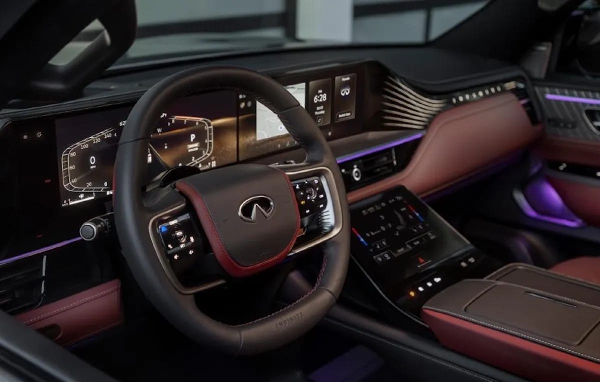
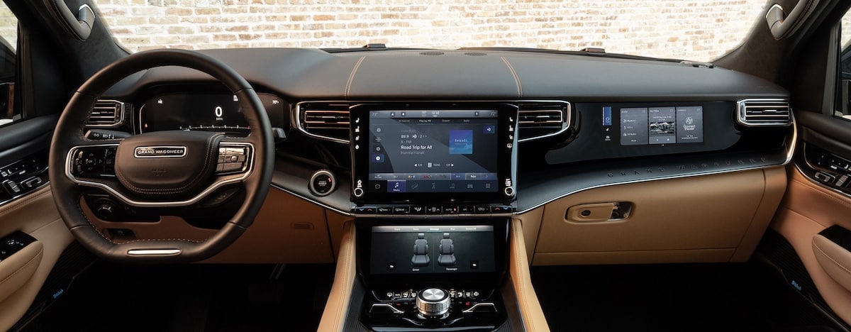
NO ONE CAN FIND ANY KNOBS
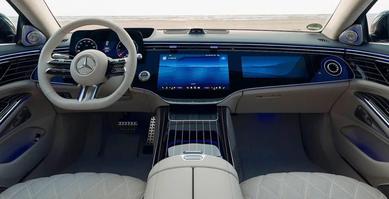
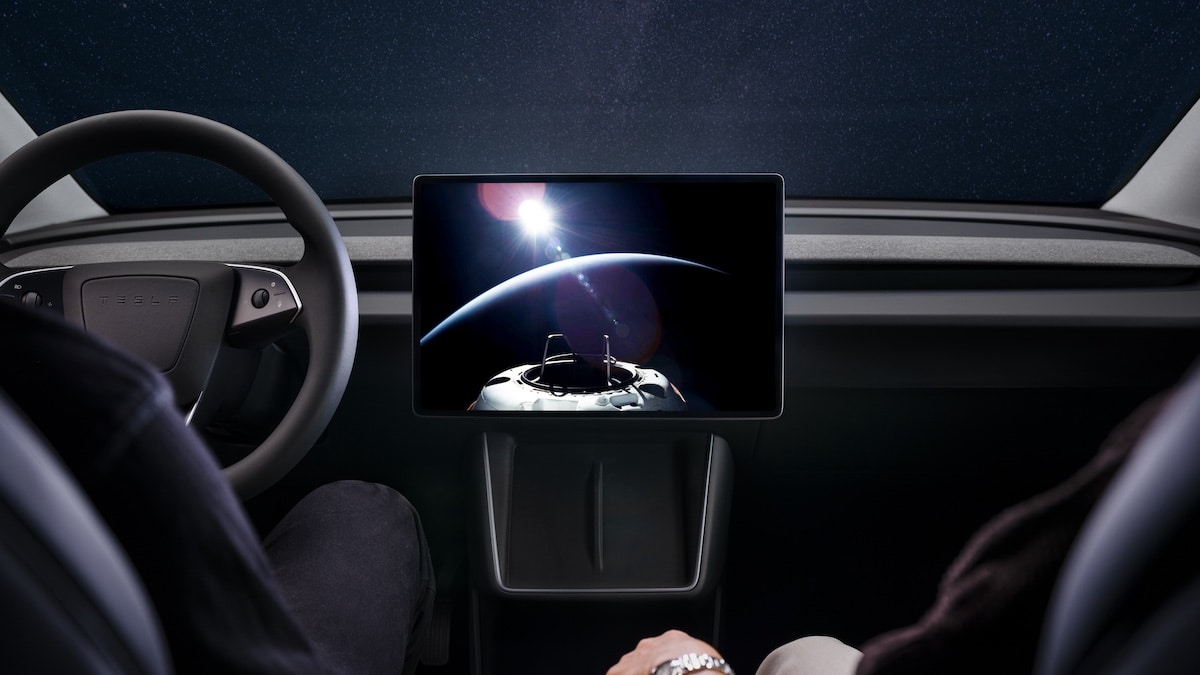
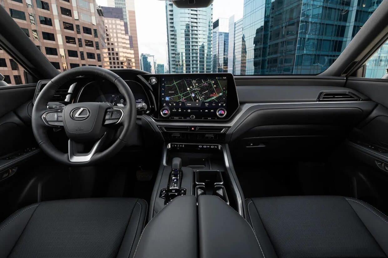
In the great name of clean design, automakers have achieved the astonishing feat of removing the one thing drivers could reliably operate without reading a manual: physical controls. Climate settings, seat heaters, mirror adjustments, drive modes; everything now lives somewhere inside a glass rectangle that demands the same attention as a tax return, only while you’re merging into traffic.
Manufacturers will tell you this is progress. Yes, and fewer lifeboats make ships look more spacious.
A knob can be found by touch. A screen requires visual negotiation. In a moving car, that distinction used to matter. Apparently, it still does—just not in the meeting rooms where these decisions are made. To put this perspective, while take five seconds to adjust something on screen while travelling at 60 mph, you car will have travelled 440 feet, or more than a football field.
DON’T LOOK FOR KNOBS. THEY’RE GONE
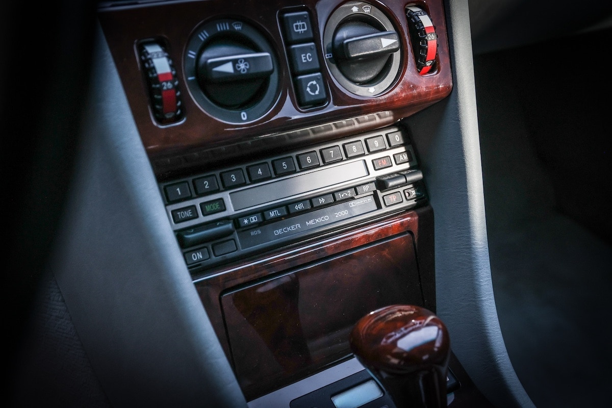
Older interiors were built on repetition. You adjusted temperature once or twice, and then your hand just knew. No thought required. It became instinct, like finding the light switch in your own kitchen. Modern interiors treat that kind of familiarity as a design flaw. Menus shift. Software updates rearrange the furniture. Sliders replace switches for reasons that are never fully explained. Even basic functions now require light administrative work.
It’s all done in the name of minimalism. Of course, designers love the word minimalism. It sounds calm, mature, Scandinavian. Now, a kitchen is minimal when it’s efficient. A moving vehicle doing 70 mph in a world full of distracted drivers is not a meditation studio. It’s a task environment where clarity used to be considered a virtue.
MATERIALS: NOW FEATURING THE LOOK OF DURABILITY
Then there’s the tactile reality of modern interiors, which resemble a spreadsheet of cost optimizations rendered in grayscale.
Glossy black plastic dominates, presumably because it looks expensive for approximately 12 minutes after delivery. Then it becomes a fingerprint museum. Soft-touch materials appear in brochures more consistently than in base trims.
Older interiors didn’t always start richer, but they often ended better. They were softened by time, wear, and use. Today’s interiors often start finished and decline from there.
THE SCREEN WON
Modern cars are undeniably more capable. They can brake for you, steer for you and warn you about things you haven’t noticed yet. The problem is not capability. It’s accumulation. Driver assistance systems live next to infotainment systems, which live next to connectivity systems, which live next to vehicle settings systems, all politely ignoring one another like strangers sharing an elevator. The result is not one intelligent system. It’s several semi-intelligent systems competing for your attention like interns who haven’t been told who’s in charge.
THE DRIVER IS NOW MERELY A SCREEN USER
Perhaps the biggest philosophical shift is this: the driver is no longer the center of the interior experience. Just a participant, a user among users. Passengers have screens. The car has a personality. The software has opinions. The ecosystem has ambitions. And the driver? The driver gets to manage all of it while also not hitting anything.
To be fair, modern interiors are safer, more connected, and vastly more capable than their ancestors. Cameras see things you can’t. Sensors anticipate mistakes. Navigation is no longer a folded paper exercise in humiliation. But progress has a habit of confusing more with better.
A car can be objectively superior in every engineering metric and still feel like it requires a brief orientation session every time you adjust the air conditioning.
AN INDUSTRY REDISCOVERS KNOBS

Some manufacturers are quietly bringing back physical controls for critical functions. Others are simplifying menus after discovering that customers do not, in fact, enjoy becoming part-time software testers just to turn down the fan speed. It turns out the radical idea may be this: drivers don’t want fewer choices. They want fewer obstacles between intention and action. Because at 70 mph, the ideal interface is not elegant. It’s immediate.
And if the industry is rediscovering anything, it’s that sometimes, the highest form of innovation is giving people back what worked before it was improved.
Editor’s note: This is an updated version of a column that first appeared on The Car Collective Substack. To subscribe to The Car Collective, click here.


